Features
Sun Apr 09 2023 LordGdogI’d like to be able to mark scenarios in the list with two more factors. Add a check box for “Unlocked” and one for “Blocked”. Would be cool if this was smart enough to tell which are available and blocked upon tapping the mission complete checkbox for the user.
Also add a way to track if the loot deck treasure card is looted or not as well as the in mission treasure chest if they exist for the mission. That way this app could track and record my progress and it would be easy to see what missions are available to me. Or if I need to repeat a mission to gain a treasure I missed.
Also a icon for missions that require building upgrades to enter would be cool.
Great App for Frosthaven
Mon Dec 26 2022 Crissspy CI used the Gloomhaven version of this app as well, and that app helped tremendously! Yes, there is a charge for the app, but it’s well worth it imo instead of constantly flipping back and forth between the two books. This way, all info is on your phone screen and is hidden until you reveal it. No books, no back and forth, no problems!
One thing I hope the developer makes note of: the app is not currently formatted to fit the iPhone screen with the camera and speaker at the top, so it is hard and sometimes impossible to read and interact with some of the prompts at the top of the screen, but I’m hoping this will be fixed!
Cool idea implemented poorly
Sat Apr 01 2023 DesignbotThe concept here has potential—however, the implementation has too many issues to be relied on at the table. A hyperlinked PDF of the scenario and section books would be more usable.
I’ve only looked at Scenario 0, but in that scenario:
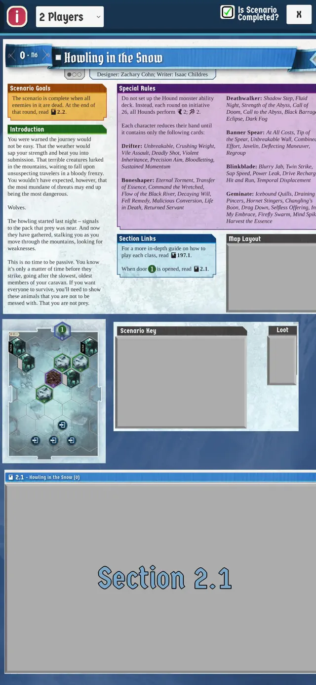
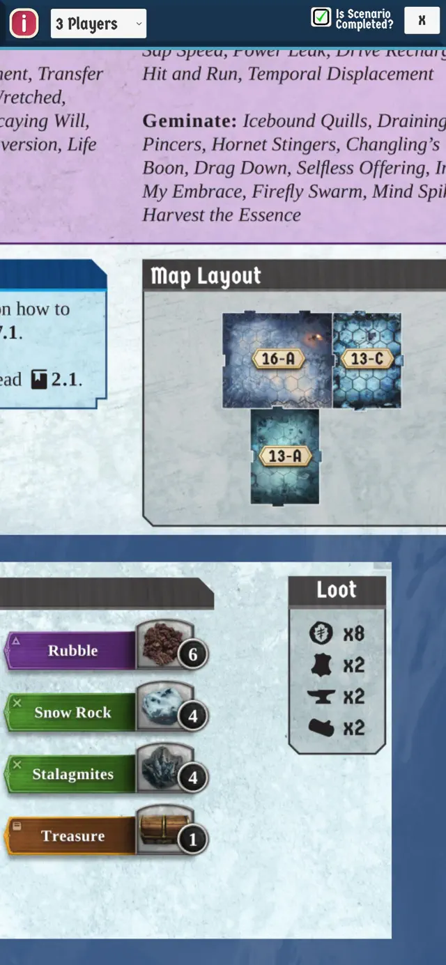
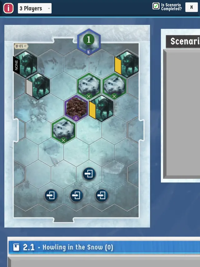
• The 6 snowdrifts in the Scenario Key are listed as rubble.
• A snowdrift in Room 1 is shown as a pile of rubble.
•In the second room, the entrance is shown as a black circle instead of the number 1, the pit-style traps are shown as mechanical traps, the 4 stalagmites are shown as snow rocks, and the normal/elite indicators are misaligned with the monsters.
• Section 197.1 is mentioned, but not included.
In general:
• Scrolling is choppy and non-standard. You cannot double-tap a section to zoom to it.
• Safe areas are not correctly implemented around the corners of the screen or notch, so UI elements are partially cropped off.
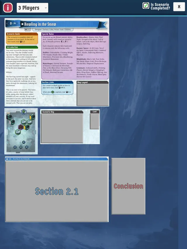
• There is a massive blank area around the content, so you can just scroll off forever into nothingness.
• References to other sections are not implemented as hyperlinks.
• The content is represented as medium-resolution images which get pixelated when you zoom in instead of as vector art or text when possible.
iPhone layout
Wed Feb 22 2023 1222224456777The scenario viewer has not been fit accordingly to the iPhone cut out. Part of the words and letters are way off to the side. Hopefully, an update to fix this can occur.
Sadly the app layouts can't be trusted
Mon Feb 27 2023 Niwotian60We started our playthrough of FH today and thought the app would speed up the setup of the game. Sadly we found significant errors in the first (zero-eth?) scenario with the layout differing from the actual scenario book. The app shows snow rocks that should actually be stalagmites in the second room. If even the first scenario has these kind of issues there is no way we can trust it for subsequent scenarios, making the app a waste of money.
Excellent App, Further Errata Needed
Wed Jan 25 2023 nickhbLove love this app and what it can do. It still needs to be updated with more errata from the official FAQ, even after the 1.02 release
Like it allot
Tue Apr 11 2023 WackybubbleSo far it’s been very handy!